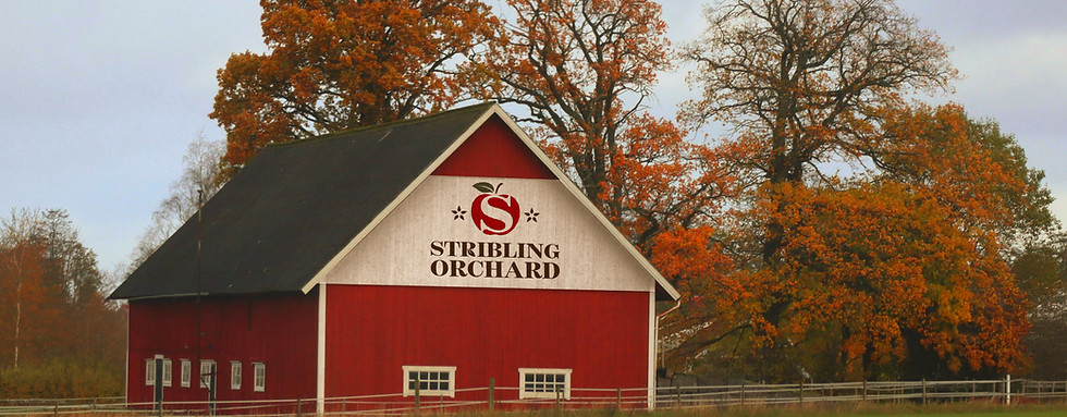
Stribling Orchard is a family-owned and operated apple orchard nestled in the foothills of the Shenandoah Valley. This is a full brand identity redesign concept that balances warmth, friendliness, and a clean rustic feel, making each interaction feel relaxed, welcoming, and exciting. This project includes a new logo, color palette, product mockups, and images to represent the overall feel of Stribling Orchard.


Logo & Colors
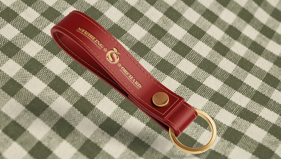
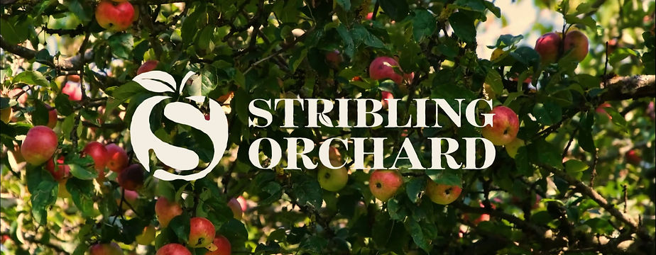
I designed the Stribling Orchard logo to have a modern yet rustic and organic feel. Each line within the design, from the typography to the icon, is rough to enhance the natural essence. The main icon consists of an apple with the Stribling "S" carved out of the middle, traditionally in red,; however, it can be changed to represent a wider variety of apple colors and be used with any additional brand colors. The leg of the "R" in Stribling has been replaced with the apple leaf to maintain consistency and recognition across all logo variations. Finally, the emblem logo represents a sticker found on an apple in the store, and can be used for practical purposes at the orchard.